3.31.2011

winging its way back

Used to be that wing chairs, like chintz were the icons of stuffy homes from days gone by. These chairs are a dime a dozen at tag sales and on Craigslist. But have you ever sat in one? The whole point of a wing chair is to cradle sitter. They are perfect for reading and dozing, they are designed to be comfortable! 

Functionality aside though, wing chairs DO take up a lot of visual space in a room. That and our associations with stuffiness can make them a challenge to use. Three designers during the past few years have used wing chairs (in three really different ways) and slowly I find myself considering one for my own living room.

Darryl Carter has long used wing backs in his quiet interiors and the chair features prominently in his book The New Traditional (which happens to be one of my design favorites). Of the wing chair, Carter says they can "define an entire room." And he uses them masterfully in his spare and pared down interiors. The chairs add visual weight to the room, but he keeps them from overwhelming the room by recovering them in pale linen or leather. So smart! Carter even included a wing chair in his now sold-out collection for Thomasville a few years ago. 

apologies, source unknown


Photographed by Simon Upton for Elle Decor 


Carter's design for Thomasville


While Carter has been using wing chairs in a restrained way, Tommy Smythe did the exact opposite in his living room in 2009 by using two smaller chairs as exclamation points. Smythe's living room caused a minor sensation on the blogosphere when it was featured in Canadian House & Home. Admitedely every element in this room —from the french giltwood mirror to the gallery wall and Hermes/Brit accessories— is on trend, but to me the vintage wing chairs recovered in Brunschwig & Fils Les Touches is the rebirth of the classic. Tommy made a bold statement and he nailed it!

Photographed by Michael Graydon for House & Home, December 2009


My personal favorite though is beautiful Georgian wing chair that Kim Fiscus used in her own home. The patinaed brown leather with the nailhead trim looks so luxurious and comfortable. The chair is at once an exclamation point but it also harmonizes with everything else in the room. 

Photographed by Reed Davis for House Beautiful, June 2008

Here is another shot of the wing chair, as it appeared in San Francisco magazine a year earlier. Interestingly the chair is one of the only pieces that made it to the HB shoot. I much prefer the way the room was styled for SF Magazine. The room is much less fussy and those viburniums are the perfect punch of color.

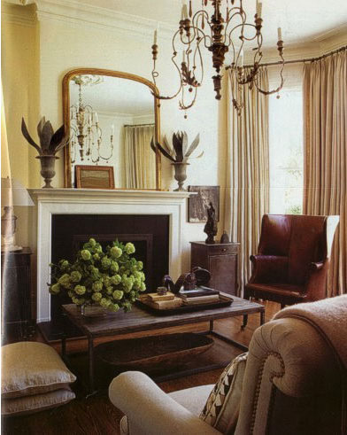
 Photographed by David Duncan Livingston by for San Francisco Magazine, August 2007


As I mentioned before, wing chairs are a dime a dozen. I'm starting to think that a leather or faux leather wing chair could be the perfect solution for a difficult corner of my living room and a safe place to send young sticky fingers to sit on. Sounds like its time to go hunting!
 

3.30.2011

this or that: blue gingham canopies

Above, a neoclassical Swedish interior features a simple bed canopied in a blue gingham with a white embroidered bedspread. The room features a traditional tiled chimney, a sidechair upholstered in the same blue check and a gorgeous chandelier.

Below, the lit a la polonaise of  Hervé Pierre, creative director for Carolina Herrera, swathed in 92 yards of blue gingham. Interestingly enough the bed also incorporates embroidered linens.


Which one do you prefer?

3.28.2011

chintz a la veere

To me, Veere Grenney is the master of understated and eclectic elegance. In his own home he has mixed periods with everything ranging from a 50s knoll table and french pieces to collection of islamic art. He makes subtle references to traditional English decorating with the use of abaca rugs and pops of chintz. Now this is chintz i can live with!

Notice classic Colefax and Fowler Bowood on the impeccable french fateuil in his bedroom. What I love about Bowood is that it works as a neutral while adding visual interest. It contrasts nicely with the black leather and dark Jansen desk. 

  apologies, source unknown

In another view of his bedroom you can see how Grenney actually mixes a number of prints including Robert Kime's Jardinieres on the chair and his own design, Ferne Park  on the canopy. I love the way he mixes prints and creates a very serene and sophisticated space. 

apologies, source unknown

hold your hibiscus horses

Just when you thought it was all about pantone's hibiscus, pale dusty blue rooms seem to keep popping up. While at first the doses of blue seemed puzzling, after some thought they seem right in line with the moment. 

I think of these rooms as the grandchildren of the chinoiserie mural revival,they are a sophisticated and up-to-date interpretation of chintz AND pink. The dusty blue ground provides the perfect foil for the pale corals and terracottas, a color that is echoed in the pale wood tones.

Images of this Elsie de Wolfe designed bedroom have been making the rounds recently.


Suzanne Tucker paired the palette with punches of citron in the bedroom she did for the Elle Decor showhouse.

 Photograph by William Abranowicz for Elle Decor February/March 2011


Lucky Magazine has picked up on the vibe in their Spring Issue of Lucky Kids
Photographed by Mei Tao for Lucky Kids, Spring 2011

If you're feeling inspired by the look, Shannon from the Designer's Attic has a few China Seas fabrics that are still available.

 This is my favorite of the two.

This larger floral is also available.


3.25.2011

Friday Farewell

In the realm of uber-feminine bedrooms, I am really drawn to this space swathed in a pink floral print. Rob Southern used it everywhere — the walls, the curtains, the headboard, the corona and bedskirt— not to mention the upholstered pieces including a daybed and a pair of bergeres. I could do without the leopard print pillow and the side tables feel a  bit dusty, but I love the overall effect of feeling enveloped in this room. And you can't go wrong with Leontine Linens


Photographed by Thibault Jeanson for House Beautiful March 2011

Wishing you all a restful weekend!

3.24.2011

this or that: hearts and flowers

It might be a bit late for Valentine's Day, but I ran across this sweet little piece over the weekend. 
It goes up for auction this Saturday and would be a great addition to a nursery or bedroom.


The colors and style of this homespun valentine remind me of the extremely cool, Rifle Paper. Anna Bond's sweet illustrations are balanced by punchy use of color and are available in a range of ways including notecards and prints. She even offers custom pieces!!


Floral Heart Print, available in two sizes


HB's Family Tree

Have you seen this?


This snazzy insert was in this month's House Beautiful. If you ask me its pretty damn cool to be able to see all of the connections, to understand the chain of influence. I've tacked mine up on my office wall and will most certainly be working my way through it. You can get yours here.

3.23.2011

blast from the past!

Seeing this last night sent shivers up my spine! 
My parents used to have this rug in their living room.


 Photo from One King's Lane

3.22.2011

chintz, anyone?

I was looking through some old issues of Domino this weekend and noticed that Dara Caponigro directed a piece on the return of Chintz, FOUR years ago. I remember reading it at the time and thinking Domino had gone off the deep end.  Here are some of the images from the August 2007 Domino article.


Photos by Max Kim-Bee


And for those of you that geek out on the history of things, I've included this two page spread from the Domino article.Click to make it bigger.

3.21.2011

inspired by... beatrix potter

We've been reading quite a bit of Beatrix Potter and I have to admit that until recently my understanding of her work was shaped mostly by nursery fabrics. The pastel pinks and blues of nursery fabrics are not to be found in the pages of her books (and I've only been looking at Peter Rabbit). Potter's use of color is warm and sophisticated. 

Mrs. Rabbit  in the soft green of the woods with her warm red cape and colorful stripe skirt. I can imagine these colors in for a moody library or reading room.
l love the the warm begian brown  and white with pops of seashell pink, blackberry and leafy green. These colors remind me of Tom Scheerer's interiors. 

And one of my favorites, Mr. Mcgregor's shed with it's bleached greys, pale terracottas, rich green and with a whisper of blue. Perfect for a sophisticated sitting room.
Not surprisingly, the illustrations remind me of some of the Farrow & Ball palette. The greens in particular are amazing: Verte de Terre (my favorite), Folly Green, Churlish Green paired with pops of color: Lulworth Blue, Pink Ground, and Blazer Red...
 
 
You can continue the inspiration and see more of Beatrix Potter's watercolors here.

3.18.2011

friday farewell


I thought I would keep the spring momentum going with this bedroom. Yellow isn't typically one of my preferred colors but this one from Provence feels right. I'm digging the contrast of the dark wood table and floor with the sunny yellow walls and fabrics. And the flowing lines of the table's cabriole leg and bed's floral vine print really bring the room together. I'm pretty sure the herringbone floors, tall ceilings and killer chandelier had nothing to do with it...

On a personal note I am hoping to get to Ikea this weekend and pick up some cheap frames for my herbier project. Then on Sunday we'll be on water duty for our friend Sarah, who is training for the Boston marathon. This weekend she'll be running 21.5 miles in preparation for her big run in April. What's another 4.5 miles?

Wherever your weekend takes you enjoy it.

See you Monday!

3.17.2011

tender


That is how i feel after this winter. It has been a long and brutal one here in Boston. We had record snowfalls — more than six feet—and it seemed like we got a blizzard just about every week. This year the snow was particularly unwelcome as our second child, Eleanor, was born in January. Having a newborn with all this snow and dreariness has been hard. But I am happy to say I think that winter is really behind us now. 

The sun is shinning, its 60°, and when I stepped into our snow savaged garden this afternoon i saw these tender beauties

i can't stop smiling.

the details: bows

One of the best parts of having two girls is the opportunity to get out all of my own girly energy. When S and I were first married I suggested a pink bedroom and he balked. A few weeks ago when I gently suggested it again he said I might have to wait until I'm a widow.

Bows are one of those girly things for which I have a soft spot. While they are unlikely to make it into my bedroom anytime soon, I am hoping to incorporate one or two bow touches in Bea's bedroom.

I find myself particularly drawn
to carved bows, be they painted or gilt.

Check out the painted bows on the bed and chair. Isn't this room so pretty?


This intricately carved gilt wood Italian mirror went for a mere $300 on auction. How I wish I had bid on it!

Or this little number, which also went for $300. I was at this auction and am now kicking myself for not having bid on it. But I did make it home with something else is just as fabulous for Bea's bedroom (more on that later).


I also love the idea of using taffeta silk bows for hanging picture frames. Designer Ryan Korban did so in his own apartment.

via The Selby

And this Swedish interior features a pair of portraits hung with the same treatment. I really like the use of a dark or neutral ribbon to offset the girly-ness of the bow itself.


This pretty brass picture frame was recently up for auction on eBay.


I think a small gilt mirror with a carved ribbon or a small, simple mirror hung from a taffeta bow would be right at home over the chest of drawers in Bea's room.

3.16.2011

emery strawberries

I just took a very quick spin through this week's 1st dibs listings and came across this sweet little piece from American Primitive Gallery. Cute, huh?
It's true, I'm a sucker for simple, repetitive graphics. However the strawberries' graphic simplicity—the pops of red placed on a broken grid—are made all the more interesting due to the variations of size, color, texture, and technique due to their handmade nature.


The gallery's description says women used to make these strawberries and fill them with iron shavings to sharpen their needles. So i did a bit of hunting around and found this great post that provides a bit more background on emery strawberries. I love it when I get to learn something new! 

The striking visual simplicity of this piece and it's representation of the domestic labors of women have me smitten. I'd love this for my office and it would look great in a crafting space or sewing room.

If you want to assemble your own collection, I took a quick spin around the web and found plenty of vintage and handmade strawberries available at very reasonable prices. Here is a lovely little example currently available on ebay. Biding starts at $4.99!


Or if you are feeling really crafty you can follow Martha's tutorial (of course she has one) and use vintage materials to produce your own collection. 

Happy Hunting!

from the big screen to your living room

I have not seen Jane Eyre yet (i admit it can be a bit difficult to get to the movies with two little ones around here), but I am really intrigued by this week's Tastemaker's sale on One Kings Lane featuring props "straight from the set" of the movie.


A closer look at one of the sets from Jane Eyre


And here, one of the tapestries offered on One King's Lane Straight from the Set Sale.


I have to say it seems like a brilliant move both on the part of OKL and the movie makers/marketers. For example, how many of us would be thrilled to own almost anything from one of Nancy Meyer's movies?

I'll take the baskets, orange bergere, and the roll arm chair from Jane's living room in
It's Complicated.


While we're at it, throw in the blue dhurrie from Erica's living room in Something's Gotta Give.


I admit, until the OKL sale I hadn't really thought about movies and set decorators in particular as "tastemakers," but it makes sense as most of these movies have much wider audiences than shelter publications. Not to mention they also have a much "longer" lifespan than a monthly as once their theater run is done these movies are often replayed through television, rentals and purchases.

The kitchen from
Something's Gotta Give, which came out in 2003, is the perfect example of the influence a movie set can have. It seems like every kitchen since has been a version of the movie's kitchen with it's stainless appliances, slate counter tops, and white subway tiles.


Nancy Meyer's film sets, masterminded by designer Beth Rubino, have been poured over and dissected by many bloggers including Julia from
Hooked on Houses and Joni from Cote de Texas whom have done a number of informative posts
. Joni even had the opportunity to interview Beth Rubino, the set designer for both movies as part of Skirted Roundtable series. Beth Rubino even revealed some of the sources she used for Jane's house in It's Complicated for SetDecor, the magazine for the Set Decorators Society of America.

One of my favorite features over at Design Sponge is also a nod to the influence of movie makers. The very clever "Living In" series does a great job at rounding up currently available furniture, accessories, and even clothing that capture the aesthetic essence of a chosen film. The series has focused on films ranging from classics such as Out of Africa to more recent movies such as An Education. Funny enough, this week's "Living In" is all about Something's Gotta Give. Below, an example of one of the round-ups from the Something's Gotta Give "Living In" post.


The real question though is what will happen with the "real" props purchased from OKL's sale. In the past movie props were destined to become authentic memorabilia—collector's items to be treated delicately and preserved in glass cases. No doubt these sales may attract some of these buyers. But I wonder if the typical OKL buyer will make use of the furniture or accessories and incorporate them into their everyday lives. Would that be weird?

What's your perspective?